Malevich argues that by pursuing art as end in itself we reach non-objective suprematism; we “arrive at the domination of form as end in itself over content and things, at non-objective suprematism—at the new realism in art, at absolute creation . (Malevich,74)” Malevich’s “zero of form” represents a series of reductive pictorial processes that lead to the final logical essence of painting. This essence, very clearly embodied by paintings in the 0.10 exhibition of 1915, is characterized by elements that are non-compositional, nonmimetic, and nonobjective. This reduction to the zero degree results in forms that are so perfectly refined that they are imbued with living autonomy. This conception of art completely abandons the idea of composition and instead treats the individual pictorial elements as autonomous, and dependent instead on weight, speed, and direction of movement. El Lissitzky reinterprets Malevich’s Suprematism which is largely planimetric and extends it into three dimensions. His body of Proun work represents an extension of Malevich’s forms characterized by ambiguous planar directionality into multiple axes of spatial ambiguity. The axonometric projections characterized in his prouns represent a sublation of perspective, leading to ambiguous space that at once disavows the infinity suggested by one point perspective and creates a work of dynamic tension and reversibility. The prouns represent another manifestation of the zero form, one that is universal and nonobjective.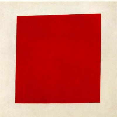
In his 1916 Manifesto, Malevich not only argues about the theoretical underpinnings about the zero form in art, but also talks about the methods used to reach it. He very clearly states that color and texture is the means to achieve and delineate the essence of form. The use of these pure color forms dominates the paintings in the 0.10 exhibition. Color is the necessary and sufficient condition for painting. It is living, independent from any referrent , and highlights the planarity of the painting surface. In Suprematism, one of the more baroque pieces of the 1915 exhibition we find elements of the first steps of Malevich’s reductive process. The piece consists of a number of flat, geometric shapes painted in various colors. The painting is also non-representational: it bears no resemblance with forms in nature. No two adjacent shapes are painted in the same color. Malevich claims that when a painting can still be “read” if you take away its color then it is not a real living painting as color should be the means through which the forms are created and distinguished from each other. Movement seems to radiate onto all four corners of the image, as the lines and shapes have varying orientations and groupings. Malevich argues that this arrangement is not a result of an aesthetic ordering, or what traditionally has been the ordering of pictorial composition according to the relationship of forms and color. Thus the individual elements are independent. Each form insists on an irrevocable existence. From this painting we see some of the lessons learned from Malevich’s exploration of Cubism. The shapes that are all parallel to the picture plane recall the conflation of space and the surface-depth ambiguity created by overlapping forms. 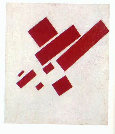
In Eight Red Rectangles we see a distillation of the reductive processes mentioned earlier. We have now established the importance of color, movement, and non-objective forms. The shapes have been reduced to rectilinear forms. The composition still possesses its non-directionality. As in Suprematism, the individual elements seem to radiate and suggest movement on all four corners of the canvas. Overlapping has now been abandoned. This painting illustrates Malevich’s new realism, characterized by “the realism of painted units of color which are constructed so that they depend neither on form, nor on colour nor on their position relative to each other.” We move on to the final step in this visual distillation, the Red Square. In this painting we find Malevich’s insistence on the life of the surface of the painting. It is a conception of art that pushes and highlights the importance of the textural elements and physicality of the painting surface. The square is what Malevich’s understands to be pinnacle of a creative form divorced from the limitations of recreating nature. The square he claims is completely alien in the natural environment and thus highlights the creative powers of the artist. This is painting as end in itself. The surface is glorified for the qualities of the surface alone. We arrive finally at the essence of painting, the zero form of art. Like the other two paintings mentioned earlier we can point to the use of color to delineate form, the directional ambiguity and the emphasis on the physicality of the painted surface. In numerical systems, zero is where we begin, the absolute starting point. This implies both the end and the start of pictorial representation. We have reached the square form, which through its lack of referentiality, its elegance, its nondirectionality, we arrive at the reduction of form to its logical conclusion. Malevich has created a system through which artists can create forms that are pure, intuitive, and creative.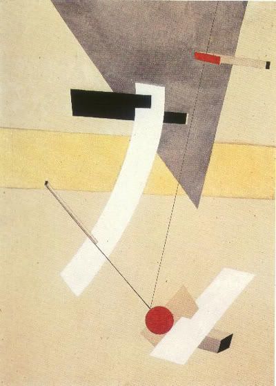
El Lissitzky’s body of “Proun” works of art is a reinterpretation of Malevich’s zero form of art. From a more general definition of the zero form: we know that it is “creative” process of art creation characterized by a rejection of copying the forms of nature and by the reduction of painting to its essential qualities. This suggests an artistic predilection toward creating an entirely novel visual vocabulary, and an entirely novel set of pictorial production. To create the new Malevich suggested a complete abandonment of known conventions of representation. In his manifesto, he denounces the horizon ring which confines artists to the forms of nature. El Lissitzky demonstrates a similar denunciation of the pictorial spaces that limit the artist’s creative abilities. To liberate the viewer from the horizon of forms, El Lissitzky argues that “it is necessary to destroy the vis-à-vis relationship” between spectator and pictorial works. El Lissitzky does this by introducing axonometric projection.(Bois, 86) Axonometric projection is an architectural technique of projecting three dimensions objects onto multiple planes. Lines in an axonometric drawing are always parallel and never converge onto a vanishing point. Axonometric projection gives us a counter to traditional one or two point perspective. One point perspective centers the viewer and therefore inscribes the viewer into the space of the picture. This suggests an anthropomorphic approach to art in spatial terms. Axonometric design with its rejection of the horizon line and vanishing point allows the viewer to situate himself however he/she wants to within the image. As Malevich creates a living form by highlighting the autonomoy of colored planes, El Lissitzky creates a new structure that one can looking into, around, and across. It ceases to become an image, and instead is a marked topographical/geographical map of multiple possible viewings. The image is thus no longer pictorial, no longer mimetic, but diagrammatic. It is then a work of creation and not of imitation.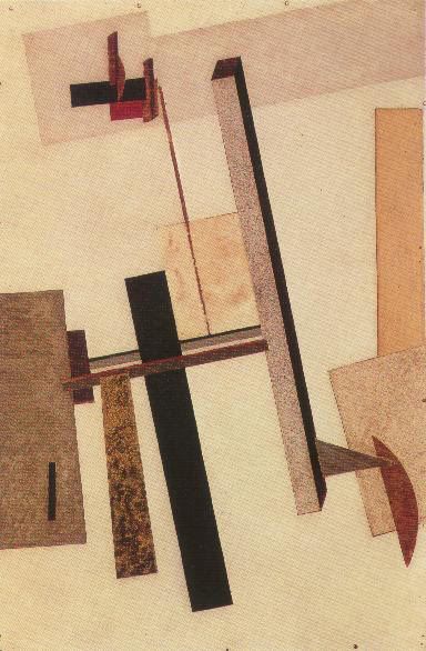
The removal of the horizon line also results in what Yve-Alain Bois calls “radical reversibility” in El Lissitzky’s work. Although Bois extends his argument to associate El Lissitzky’s proun imagery to his political photomontages, radical reversibility within the proun context refers to the oscillation between concavities and projections. Thus a cube can at once oscillate between moving back into space and projecting out of the picture plane. This coupled with the similar ambiguity of the two dimensional elements creates a multifaceted oscillation between planes and volumes. This radical reversibility is certainly a reinterpretation of Malevich’s planimetric nondirectionality, an application of the same rules of ambiguity into thee dimensions. This experimentation is enabled by Malevich’s conception of the importance of non-interrupted planes. El Lissitzky restructures this planes into three dimensional forms and breaks away from Malevich’s planimetric compositions. Taking stock of the Malevich inspired “zero-form of Lissitzky’s” prouns, let us inspect Proun R.V.N.2, a mixed media work from 1923. The two dimensional elements harkens back to the simple geometrical forms delineated by color so characteristic of the Malevich works of the 0.10 exhibition. Two dimensional shapes overlap each other. The central cross structure suggested by the negative image created by the four brown corner squares centers our vision into what is going to be a barrage of spatial and two dimensional ambiguities. The white circle is not quite centered complicating the reversibility of flat shapes. On the left the squares corners meet at arc of the circle while on the right side, the squares pierce the shapes creating an interesting dialectic between surface and depth, a dynamic tension of spatial ambiguity. On top of the white circle there are three rectilinear volumes oriented at 90 from each other rotated found the central axis of the image, and around the central axis of their bodies as well. The three volumes make sense as projections moving out of the picture plane but the image breaks down if we switch gears and interpret these forms to be moving into the plane of the picture. In Proun 2c, 1920 Malevich intersperses the flat planes of color with the volumes further keying into the displacement of the viewer and the utter novelty of the visual experience. Volumes jut out of the surfaces rejecting normal Euclidean space, and gravitational constraints as well. By rearranging Malevich’s planar elements into both two dimensional overlapping planes and three dimensional forms, Lissitzky creates a new zero form--one that gets to the essence of painting in its redefinition of pictorial space. The new form breaks out of Malevich’s heralded surface and displaces the viewer’s sense of position with respect to the image, subverts known conventions of the three dimensional and creates a work of art that is indeed a living work of art.
31.1.06
The Zero Form: Space, Surface, and Creation in Malevich and El Lissitzky
at 9:31 PM
15.1.06
Some things to remember
I've been very nervous about life recently. Today, I've had even more troubling conversations that have made me more squirmy about the future. I remembered Steve Jobs' speech. I think some things are worth noting. Essentially, these are the three "lessons" concluding each of the three Jobs' stories.
"Your time is limited, so don't waste it living someone else's life. Don't be trapped by dogma — which is living with the results of other people's thinking. Don't let the noise of others' opinions drown out your own inner voice. And most important, have the courage to follow your heart and intuition. They somehow already know what you truly want to become. Everything else is secondary."
"Again, you can't connect the dots looking forward; you can only connect them looking backwards. So you have to trust that the dots will somehow connect in your future. You have to trust in something — your gut, destiny, life, karma, whatever. This approach has never let me down, and it has made all the difference in my life."
"Sometimes life hits you in the head with a brick. Don't lose faith. I'm convinced that the only thing that kept me going was that I loved what I did. You've got to find what you love. And that is as true for your work as it is for your lovers. Your work is going to fill a large part of your life, and the only way to be truly satisfied is to do what you believe is great work. And the only way to do great work is to love what you do. If you haven't found it yet, keep looking. Don't settle. As with all matters of the heart, you'll know when you find it. And, like any great relationship, it just gets better and better as the years roll on. So keep looking until you find it. Don't settle."
Well thanks, Mr.-Apple-CEO-Man. Here's to everything vital, and meaningful, and beautiful, and important in my life. I better start bracing myself. Wish me luck.
at 12:56 AM
