Why am I noticing a collective fascination with Pirates?
15.12.05
13.12.05
The Friendly Place
I find it amazing that all the workers at Ace Hardware just seem happy and are incredibly nice and accomodating! Its so amazing. It gives me faith in the world again. Yay, workers of Ace Hardware.
12.12.05
6.12.05
Oh Nostalgia
I remember the Friday nights when I studied for midterms for Anatomy and Physiology in high school. I would sit there, stare at the wall, listening to bad rock music, as the names of muscles, bones, the bodily processeses of circulation, respiration, and the magic of wound repair would weave through my brain, like a loopy, tangled mess of random facts. Or memorizing the twelve cranial nerves with only 2 hours left before the midterm starts. On Old Olympus..... The facts would leave my brain as quickly as they entered.
Oh I'm glad my education is now more substantive. Painful. But Substantive.
21.11.05

17.11.05
Surface and Depth in Cubist Painting
Clement Greenberg, in his essay, Modernist Painting, argues that the essential and unique element of a painting is its flatness . Literal flatness is the physical flatness of the surface of the canvas and a depicted flatness is the flatness portrayed by the artist’s usage of form, shape, and value in the image. In Cubism, where traditional modes of creating mimetic space within the image have been abandoned, we find a conflation of literal and depicted flatness. Previously, linear perspective has been the most popular means of depicting space in an image. This same perspective orders the canvas into clear and mathematical renderings of planes and depth. Cubists created a method of representation that completely abandoned the use of perspective. This exploration delineated the necessary and sufficient conditions of a pictorial space that demonstrates depth without resorting to naturalistic painting techniques. Both artists achieved this by allowing both literal and depicted flatness to overlap and sandwich each other on the picture plane, creating a sense of spatial ambiguity. The oscillation between surface and depth creates an illusion of space and a new method of signification that ultimately breaks away from the representational. In doing so, both artists demonstrate the limits of painting as opposed to the limits of natural representation.
Braque, The Portuguese, 1911
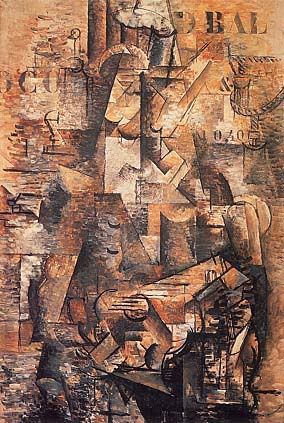
In Braque’s 1911 painting, The Portuguese, we find a good example of the overlapping planes of literal and depicted flatness. The depicted flatness consists of the amalgam of planes painted parallel to the picture plane, the unconventional use of chiaroscuro, and the lines that signify open and overlapping forms. The picture consists of multiple geometric shapes set side by side in a shading scheme that does not render the objects to look three dimensional and instead create a lattice of seemingly incongruous gradients of light and dark across the picture plane. Further, in the image we often find dark objects adjacent to completely bright objects. In a naturalistic painting with a well- defined light source, this cannot occur if we assume that the objects are three- dimensional. The shapes or facets are all parallel to the picture plane, as none of the lines seem to signify traditional orthogonals that recede into a single vanishing point. The diagonal lines in the image do not converge and instead seem to form edges of shapes and objects. The grid of geometric elements creates a compressed cubist space of pattern across a single plane on the canvas.
The literal surface of the painting is hinted at by several visual cues. The most prominent visual cue is Braque’s use of stenciled letters on the upper half of the image. Letters provide an interesting counterpoint to the other graphic elements of the painting because they occupy a physical space while connoting a linguistic non-representational element within the image. Thus, the letters are graphic elements that both have color, line, shape, form within the picture plane, but they also represent language and semantic meaning. Thus when we see letters, we are at once convinced of their non-representational meaning. Letters occupy a space on the picture plane that is on a different level than the depicted flatness. The letters sit on the literal surface and highlight the flatness of the canvas. However this flatness is made ambiguous by brushstrokes that interrupts the flatness of the stenciled letters. In isolated areas in the painting we find the first instance of oscillation between surface and depth. The stenciled letters’ unequivocal frontality is interrupted by brushstrokes that had previously belonged to the background grid of cubist shapes and non-mimetic chiaroscuro. The literal, depicted, and literal flatness are interspersed between each other.
More of these ambiguities between both elements exist within the image. The lack of orthogonals and traditional depth cues cause the space to contract making it hard to synthesize a unified image. When both literal and depicted planes are parallel to each other, it is difficult to determine their spatial relations. Thus we find elements in the image where both literal and depicted surfaces mesh together and create an illusion of a surface that is deconstructed. The line, shape and form become an unintelligible mass of pictorial elements. Both artists mediate this by introducing the use of line and contours of shapes that signify a more “representational” rendering of the subject matter. For instance, in The Portuguese we find lines that depict guitar frets, a nose on profile, an arm, and a mouth. These depicted objects are smattered across the canvas pinning the unmoored chiaroscuro into localized areas of pictorial coherence. These shapes break the grid of cubist geometry while still appearing to belong to the same picture plane. This prevents the image from breaking down into complete abstraction while still maintaining its depiction of absolute flatness.
Braque. Still Life with Violin and Pitcher
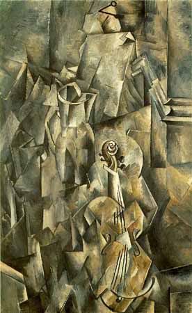
In another Braque painting, Still Life with Violin and Pitcher, a similar repetition of lines and shapes create a flat geometric grid. Similarly, the grid is interrupted by pictorial elements that add a sense of order to the mosaic of parallel facets and planes. However, in this image, Braque takes one graphic element and renders it with a high sense of realism, or trompe-l’oeil. The trompe-l’oeil pin rendered with shadow and linear perspective on the upper area of the canvas further highlights the sense of flatness of the other elements of the picture and synthesizes all the other elements into a unified picture plane that rests beneath the 3-d surface of the pin. The three dimensional form of the pin and the space that it occupies unifies the geometric patterns into a single flat surface. The pegs and the peg frameset are also painted with the same high degree of realism and thre-dimensionality. Similarly, the juxtaposition between the flat pictorial cubist elements of the geometric grid and the three- dimensionality of forms rendered in accurate chiaroscuro creates a dynamic tension between the various planes in the image. The trompe-l’oeil pin sandwiched between the literal flatness of the canvas and the depicted flatness of the imagery again oscillates between surface and depth. While we initially apprehend the two-dimensionality of the facetted shapes, the “surface” is pushed back when we realize the existence of the pin, which itself has size, dimension and occupies a three dimensional space.
Picasso. Glass and Bottle of Suze. 1912
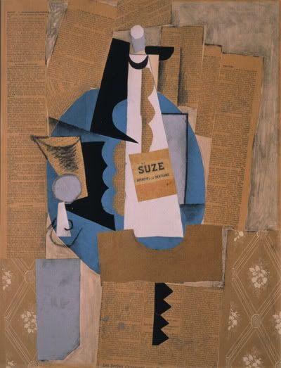
A similar oscillation of surface and depth occur in papier colle. Greenberg explains that the progression of using stenciled letters, to the use of large areas of wood veneer or sand synthesized the cubist geometric grid into a larger shapes that balanced the large areas occupied by these new pictorial additions grew naturally out of the way in which the individual elements of the images were being read. Thus in Synthetic Cubism, the facetted planes completely disappear and are replaced by large areas of paper cut-outs or newsprint. Similarly, surface and depth oscillate as the abandonment of chiaroscuro allows for a figure-ground reversal in several areas of the canvas. For instance, in Picasso’s 1912 papier colle, Glass and Bottle of Suze, the blue circular shape in the center of the image has a physicality reminiscent of the stenciled block letters of analytical cubism but it also serves as a background plane to the planes occupied by the glass and bottle. Its serves both as depicted background because of the way in which the other depicted objects overlap the shape and also as a marker of the literal flatness of the picture as both foreground, the white Suze bottle, and background, the blue plate share the same planar depth in the picture plane. Both paper cut-outs exist on the same plane even if they denote two objects that are overlapping each other.
Picasso. Guitar, Sheet Music, and Glass. 1912
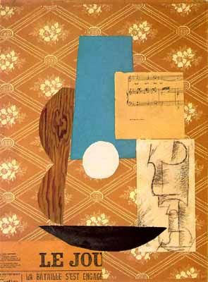
Remnants of the linear elements delineating shape still occur at several parts of the image, most visibly on the surface of the glass and sometimes outlining the edges of the cut or torn newsprint and paper. The rows of overlapping newsprint highlight the literal flatness of the surface on which it is pasted but the intermittent charcoal outlines around the newsprint push the plane back, giving it a sense of depth. The newsprint functions as both surface and background, figure and ground.
In Picasso’s 1912 picture, Guitar, Sheet Music, and Glass, multiple “readings” of the configurations of the paper cut-outs exist. For instance, the piece of white paper with a charcoal drawing depicts both a cup and the shape of the guitar. Similarly the bottom black shape can both be a bowl or the outline of the guitar. Aside from the slight modeling on the cup, no effort is made at depicting three-dimensionality. The painting is a composite of shapes that all occupy the literal surface of the picture plane. Through the viewer’s own cognitive interpretations the configuration of shapes reveal a construction that is pictorially coherent. Even without a depicted surface and depth, the viewer restructures the image according to the relationship of the individual parts to the whole. A foreground can be simultaneously a background as the cup can once be a figure, or the ground behind the guitar. As the surface becomes completely flat, and depth is annihilated, the images take on a higher degree of ambiguity. The Cubists invent a new method of representation in which the undepicted is transformed into a coherent image without the aid of naturalistic painting techniques. Through the ambiguity of the depicted surfaces, the image is reconstructed by its literal and depicted flatness.
Funny how that works
Why do I find gratification in a good grade? That really doesn't make any sense.
14.11.05
Graffix
Something about a DJ named Kevvy Kev. An interesting character really. I'll post a link about him later.
12.11.05
9.11.05
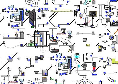 An unbelievably LARGE array of Rube Goldberg Mechanisms, Robots, people, and blue balls!
 7.11.05
the woooorld is changing
This project with Microsoft has really opened my world to the world of user interface design. I find it interesting because of the notion that IDEAS are more important than the actual IMPLEMENTATION of real or virtual products. I think this is the first time, where its been drilled in my head where the actual mapping of user experiences are actually more important than just the inherent "coolness" or excellence of the product (i.e. no matter how awesome/beautiful/technologically savvy your product is, it still has to be used by a human being and that is what matters the most,duh.) 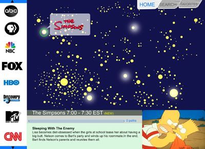
Here is the current iteration of the main menu for an interface. The metaphor for
exploration is looking at a "galaxy" of stars. This leads you to a network of related programming, hopefully clusters exist that link certain types of genres. Jon of course,being the math dork that he is, told me that this system is actually sort of mathematically impossible. The mapping cannot be one to one. I think for now I am content with having multiple stars being shown?
So one scrolls at this "galaxy" of stars to find different types of shows and explore new possibilities. It is essentially a histogram of all shows currently being viewed and the user can make his/her choices accordingly, depending on how nonconformist or conformist he/she wants to be.
A lot of talk has actually been built around these new "maps. For instance there is
Google Maps, then there's Google Earth, there's a number of really great API's for Yahoo Maps . These API's enable people to increase functionality of a certain product. For instance someone has used Google Map to show crime rates in Chicago, by geographic area. Similarly Yahoo Maps has its vast array of applications too.
An article in Wired magazine spells it out pretty nicely.:
"How did we get here? This technology used to be top-secret government stuff. Then, in the 1980s, McDonald's dumped thousands into buying satellite images and developing software called Quintillion, which predicted the growth of cities and school districts. Ever notice there's always a McDonald's where you'd expect one? The company looked down from the heavens and dropped new franchises wherever it saw the right combination of kids, interstates, and suburbs, using one of the first geographic information systems for business analysis."
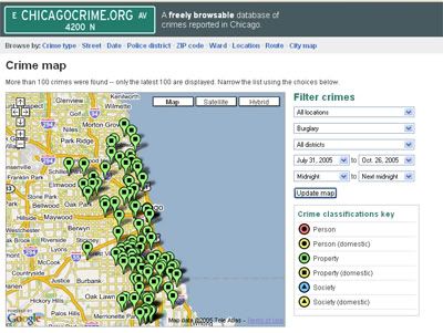
Mapping of real time crimes occuring by type of crime, and geographic area at Chicagocrime.org using the google map interface

Real Time Caltrain Schedule
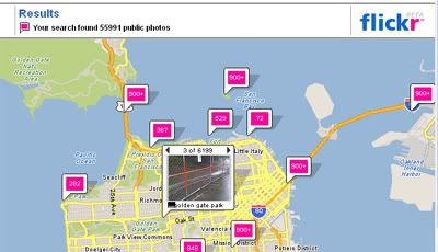
Flickr Photos by City
I'm excited to see where this will go.
3.11.05
1.11.05
30.10.05
28.10.05
A Mix Tape of How It Feels To Be With You
As I am apt to do such things...
1. Till There was You - the Beatles
2. Sadie - Joanna Newsom
3. My Wandering Days are Over - Belle and Sebastian
4. Super Me - Velvet Teen
5. I Found a Reason - Cat Power
6. Hardest Geometry Problem in the World - Mark Mothersbaugh
7. Takk - Sigur Ross
8. Concerning the UFO Sighting near Highland,Illinois - Sufjan Stevens
9. Sunshine and Clouds - Clap your Hands Say Yeah
10. The Luckiest - Ben Folds
23.10.05
On a different note...
Let me pose two questions... or maybe a question and an observation... or would that rather be two observations?
1) Why is it that people often use the phrase "impending doom". Does doom always have to impend? What about an inevitable doom, or a doom-in-progress, or a concurrent doom? Something of that sort?
2) I just saw a photo of a memorial of sorts in Nagasaki with the inscription "God is Love." I wonder, if god is love, and love is the feeling I have toward Jon, then maybe God isn't so bad after all. Because if God is indeed love and if he repressented the totality of all the good memories I've had, then he can't be all that bad.
Back to toiling. Isn't it funny. That sounds like Toilet. Toiling is Crappy.
On a good note, and very much related to toilets and crapping, I talked to Songhua and asked if I could get switched out of Sunday Bathroom Crashing and very kindly obliged. Yay for kind House managers.
Why virtual relationships are purer?
The literature also suggests several reasons for why this might occur. For example,
Walther (1996) suggested that one of the reasons why hyperpersonal interactions – interactions that are more intimate, more intense, more salient because of the communication channel – occur in CMC is because participants can reallocate cognitive resources typically used to maintain socially acceptable non-verbal gestures in face-to-face interactions and focus on the structure and content of the message itself. The message itself then comes across as more personal and articulate. Indeed, in virtual worlds where we do not have to constantly worry about how we look and behave, we would be able to dedicate more cognitive resources to the message itself.
Nick Yee's paper on MMORPG's
21.10.05
A Better Image?
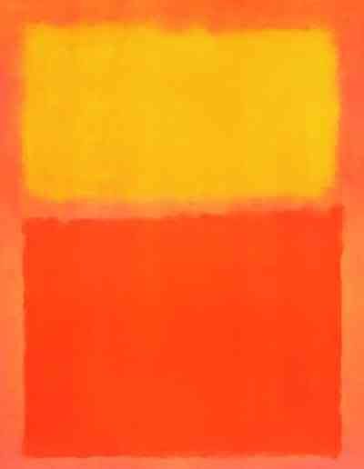
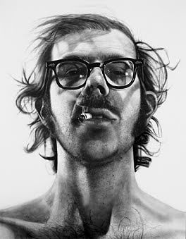
Which is the better image?
The only information you have:
Mark Rothko. Orange and Yellow. 1956
47" X 39"
"I favor the simple expression of the complex thought"
Chuck Close. Big Self-Portrait 1967-1968
107.5" X 83"
"paintings first and portraits second"
Those Crazy Italians
MANIFESTO OF FUTURISM
1. We want to sing the love of danger, the habit of energy and rashness.
2. The essential elements of our poetry will be courage, audacity and revolt.
3. Literature has up to now magnified pensive immobility, ecstasy and slumber. We want to exalt movements of aggression, feverish sleeplessness, the double march, the perilous leap, the slap and the blow with the fist.
4. We declare that the splendor of the world has been enriched by a new beauty: the beauty of speed. A racing automobile with its bonnet adorned with great tubes like serpents with explosive breath ... a roaring motor car which seems to run on machine-gun fire, is more beautiful than the Victory of Samothrace.
5. We want to sing the man at the wheel, the ideal axis of which crosses the earth, itself hurled along its orbit.
6. The poet must spend himself with warmth, glamour and prodigality to increase the enthusiastic fervor of the primordial elements.
7. Beauty exists only in struggle. There is no masterpiece that has not an aggressive character. Poetry must be a violent assault on the forces of the unknown, to force them to bow before man.
8. We are on the extreme promontory of the centuries! What is the use of looking behind at the moment when we must open the mysterious shutters of the impossible? Time and Space died yesterday. We are already living in the absolute, since we have already created eternal, omnipresent speed.
9. We want to glorify war - the only cure for the world - militarism, patriotism, the destructive gesture of the anarchists, the beautiful ideas which kill, and contempt for woman.
10. We want to demolish museums and libraries, fight morality, feminism and all opportunist and utilitarian cowardice.
11. We will sing of the great crowds agitated by work, pleasure and revolt; the multi-colored and polyphonic surf of revolutions in modern capitals: the nocturnal vibration of the arsenals and the workshops beneath their violent electric moons: the gluttonous railway stations devouring smoking serpents; factories suspended from the clouds by the thread of their smoke; bridges with the leap of gymnasts flung across the diabolic cutlery of sunny rivers: adventurous steamers sniffing the horizon; great-breasted locomotives, puffing on the rails like enormous steel horses with long tubes for bridle, and the gliding flight of aeroplanes whose propeller sounds like the flapping of a flag and the applause of enthusiastic crowds.
Hey they made some good art.
19.10.05
Oh Paper-age
"There is an inherent truth which must be disengaged from the outwared appearances of the objected to be represented... Exactitude is not truth"
-- Matisse
Revived? Sort of
My computer feels like a wilting patient just coming off of a really bad accident. It is quite delicate. Every now and then (i.e 15 minutes) I have to restart it because of a memory allocation error. Further, I now cannot upload any USB devices into it and currently have zero working applications on my computer. However, this "internet" capacity has now put the world at my fingertips as Jon puts it.
I hope that the problems get fixed soon enoough and my computer be restored to its old glory.
18.10.05
Lao-tzu knows it
manifest plainness,
embrace simplicity,
reduce selfishness,
have few desires.
-Lao-tzu
can I really do that?
an interesting world view.
17.10.05
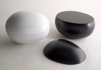
Naoto Fukasawa
Naoto Fukasawa is a really really amazing designer. He has a sense of humility and skill in designing his products that is astounding. In the world of 3d Cad and easily-modifiable curvilinear surfaces so commonplace in consumer products it is refreshing to find someone so honest, so skilled with such an economical use of visual and design cues. I like Fukasawa because of his attitude as a designer. He says that really good designs show the absence of the designer's ego, an attitude very rarely found in contemporary western design (i.e. Rashid and his ilk) 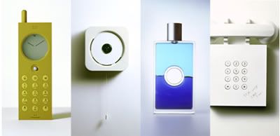
Here is another direct quote:
“My approach to design is located somewhere between the subjective and the objective. In plus-minus terms it might appear to be all about adding and subtracting, but that isn't what it's about. I locate myself at zero, the ideal median point. You don't notice when it's not necessary to do so, but if you look closer, you can see that it's been well thought out. What I do therefore is to give the design some depth so that people who appreciate such things are able to do so. People who aren't concerned about such matters can just get on and use the products and become absorbed in this action. In order to maintain both these elements, it's essential that neither is too obtrusive and that an ideal balance is maintained. Depending on the situation and the context, the design may seem to make the product very easy to use. On other occasions, the design blends into the environment without stressing its identity, playing a role behind the scenes as it were. This is what I mean when I talk about “plus-minus zero.”
I suppose my approach has something in common with the affordance approach and in that respect differs from previous types of design in which the emphasis is placed on the identity and impact of the object itself or on deliberately avant-garde forms of expression. It's all about discovering the essence of new design as it lurks within everyday life as represented by the idea of uncovering things there to be found. What I try to do is to discover the essence of new design latent in the everyday environment.”
Fukasawa also has a visual aesthetic that is minimal and almost anti-technical and really ANTI-CAD looking that is very attractive. He has a sensibility for "the simple" and for products that find its value with its relation to its environment. His works ofter spur a sense of desire for the mundane and for the ordinary.
“I think about what is “iconic” for a sofa or a watch. I am not thinking to expose myself, I am thinking more about the common view of products. If I make something iconic then people say, ‘Oh, I know this one!’ – but I ask them, ‘Why do you know, because you haven’t seen it before!’ It means I am interested to describe how people already share something. Does that make sense?”

"Fukasawa’s search for the “iconic” product, the product that communicates its function and identity so efficiently that people recognise it automatically, means that his work cannot be overtly radical. “If I wanted to design a completely new nice telephone I can’t remove the image of the ugly old telephone because people’s image of the telephone is of the ugly old one,” he says. “I gently show new things and mix them together.”
“People say I’m a good creator of ideas, but I’m more a good shape-maker. Really, you need a good form-making designer who can make good ideas. But I’m on the other side. Give me an ugly object and I can make it better like magic.”
Ideo's Profile of Naoto Fukasawa
Revolutionary Tides
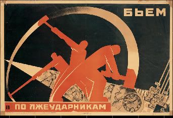
Jon was here over the weekend. We went to see the Revolutionary Tides show at the Cantor Arts Center. It was really amazing. I thought it was interesting how varied cultures even with diametrically opposed political views could coalesce in the visual representation of their ideologies. The Russian posters were the most stunning I thought. For some reason American painting always seems so ordinary and watered down, and mainstream, secular. I wonder if I think that because I actually live in America and the visual vocabulary has become so banal, or if American graphic designers are just inferior?
Design: Oscillations of a Multifaceted Identity
Every machine is a spiritualization of an organism
The existing discourse in design is framed in the context of form vs. function, machine vs. natural aesthetic, bourgeoisie vs. cultural elite, modernism vs. primitivism, and the commercial vs. ethical. Often in western tradition, opposing dichotomies exist to help deconstruct highly nuanced categories. Thus, in the history of design we are often presented with these notions in tandem and often opposed to each other as though implying that design has been a struggle between opposing predominant trains of thought. However these rough demarcations often mask the dynamic nature of the discipline and its more frequent oscillations and the existence of design artifacts that simultaneously hold various opposing categories. While it is arguably naïve to opt for an overarching structure of design that encompasses all these definitions it is reasonable to postulate that good design can span these irreconcilable polar opposites and often embrace a previously unacceptable norm. Design finds rich and salient manifestations by a process of systematic integration with the patterns of human action. Design ultimately achieves this by mediating between vocabularies that have previously been obtuse or situated within a cultural, economic, technical, or artistic minority and cast them in a vocabulary that is at once accessible, multifaceted and ultimately human.
We see these binary and seemingly contradictory themes dictate the philosophies and design in the canonical figures of design history as well as in the design of objects and selection of culturally relevant artifacts. This is especially evident in the debate between Hermann Muthesius and Henry van de Velde and in the stark differences of points of view between Raymond Loewy’s capitalistic zeal for reinventing product identity and Henry Dreyfuss’s user centered “design is for people” approach, or with the move toward ornamentation with the arts and crafts movement in contradiction with the sparse rationality of the international style. During the Werkbund Conference of 1914, Van de Velde expresses a distrust of anything that might sterilize his actions and stifle his freedom of thought or a ‘universally valid form that he sees only as a mask that seeks to make a virtue out of incapacity (). In contrast, Muthesius had a faith in standardization as a means to creative a clear design language that will be distinctive of the Germans. He also believed in the simplicity of forms and in the creation of objects that embraced the new possibilities created by the industrial revolution rather than spurn them or rein them in with selective design. Muthesius and Van de Velde both sought an authenticity in design that expressed honesty and an unequivocal expression of a point of view. Muthesius, like the many functionalists and anti- ornamentalists that follow him ( eg. Le Corbusier, Loos, Bauhaus, The Ulm School) believed that purity of form was nothing more than a symbol for a purity of mind and therefore a more sincere expression of design. Van the Velde and the others who have design philosophies akin to his (Mcintosh, the Eames, the Memphis design movement) sought to have a more vital and artistic approach to design, to be able to express creative and individual expression into design. These divergent attitudes toward design fail to underscore its main goal, that is to create an effectively constructed and well communicated form that expresses clarity in its function, execution and ability to engage the user whether it is through engaging his different senses, enabling the user to perform a task or to appeal to his aesthetic or philosophical tastes. Design is a dangerously all-encompassing label with numerous categories in its orbit and opposing ideas in its history. It is often seen as a totality of various points of view whether technological, social, emotional, rational, ethical, aesthetic, and cultural. Thus we come to the realization that any conclusive definition of design is impossible. One could only guess as to the many permutations of design that exists. However one could argue that there is successful and unsuccessful design and therefore its various manifestations have been subject to a value judgment determined by present cultural norms and history. Successful design relies on a clarity and honesty of intent and execution that communicates a sense of utility and pleasure in its usage. While the polar opposite characterizations of design give insight into the concerns that go into these definitions, there are points of convergences where anomalous categories exist, things which transgress the binary divide and hold a particular interest for me because it points to a particularly strong and richer design point of view. These critical points exist in the different facets of design and I will outline clearly how they have been played out and resolved throughout design history.
Technology (the logical and aesthetic language of design)
The triumph of the industrial revolution ushered in the first incarnation of the break down of what is arguably the most visible of these dichotomies (form vs. function). Since the separation of art and craft during the Renaissance, the practice of design (i.e. the process of planning and executing products that have functionality as its primary interest) has had a separation with the motivations of art for art’s sake. Thus the world was filled with artworks unsurpassed in their value as objects of ornament and cultural productions and objects that were highly mundane but functional. However, the advancement of engineering as a profession together with the advancement of mechanical and electrical technologies lead to a proliferation of structures and objects that whose beauty were a strange and unexpected side-effect of their mechanical efficiencies. It is especially notable that these devices were not intended to be objects of design, or designed to be objects of desire, or intended to be anything other than its explicit function deriving from its compliance with the laws of physics and scientific experimentation. Nothing could be farther from our conception of design as an integration of a completely rational and objective object into the sphere of well designed objects. Thus giant electric generating turbines, engines, and industrial artifacts became the inspirational driving force behind the Futurist movements, Le Corbusier’s reconception of life as a mechanical problem and ultimately to the Bauhaus principle of using the powers of industrial production in the service of beauty. So we see a constant oscillation between the different purposes of technology and its relationship with beauty, personal expression and design. Initially technology has, to quote Richard Buchanan in his essay, Declaration of Design: Rhetoric, Argument and Demonstration in Design Practice, provided the logos of the design argument. Design which Buchanan contends is a “rhetorical activity that relies on technology to be the backbone of a design argument […] In essence, the problem of technological reasoning in design is the way the designer manipulates materials and processes to solve practical problems of human activity”( Margolin, 98). This activity might sound rather banal and certainly technology has been initially viewed as the mere enabler of design thinking, the means through which ideas ould be executed to their full completion. The sudden break in this interpretation occurs at the onset of modernism where we shift from viewing technology as a means to execute design to the embodiment of good design. It is not the way to achieve design, it is good design. The engineering and scientific process is then cast as a valid design methodology one that when wedded with previously ‘artistic’ domain of design has produced stunning results. This movement evolved from genuine acceptance of the nature of technology, the celebration of the machine and an awareness of the present that was radically different from the past. It is even arguable that this respect for the objective and self effacing design methodologies of the engineer that address problems at their fundamental physical and compositional underpinnings has trickled into the prevailing value in art criticism. The art critic Choicy highlights the importance of form as the logical consequence of technique and the value of technique and construction in the creative process. The architect and designer is expected to make an educated appraisal of the problem before him after which the form of the building would logically follow from the technical means at his disposal. This casts design solutions and gives it a claim to ethos, a rightful place that is not merely a superficial indulgence. This paradigm in design thinking holds particularly true today with the technological revolution and the miniaturization of technologies and the silicon revolution. With Moore’s Law and a continuous packing of circuit elements increasing by a factor of 2^(1/2)every year it is hard to say what new paradigms of design thinking could be achieved as a result of this revolution. However, technology has served both as design inspiration and design enabler. It has inspired many an art movement, Futurism and Cubism to name a few. Thus it has been able to simultaneously hold these disparate categorizations gracefully. Today, technology at its rawest is hardly accessible to the general public. Design has taken equations, scientific formulae, and engineering diagrams to tangible entities that provide delight, utility and gain public acceptance.
Social
Products have an undeniable ability to change lives. A professor and I were having a conversation yesterday and my watch, like most digital Casios, has been set to beep every hour on the hour. “Is it seven already”, he inquired. I had informed him that I set my watch 4 minutes fast just to make sure that I get to my lectures on time. After hearing this he expressed regret that he had recently purchased a new cell phone with an automatic time set-up being fed from an atomic clock sent through a digital signal. He jokingly said that it felt like being trapped in a universe were time was set out in unchangeable increments. My Casio afforded me the ultimate power over my destiny – the time set-up button.
Design has a way of coordinating lives and lifestyles. It integrates objects into social activities. A successful design is a conflation of the technological or artistic devices that enable it, the current social conditions that choose to accept a certain design point of view. It is a process of bestowing things with added value. Design links the economic to the cultural. It is a way of restoring meaning to an array of simulacra, combating the presence of meaningless objects. This goal is at odds with the present phase of the capitalist development where market conditions are dictated by the desire and buying patterns of consumers. Thus more theoretical modernist design tenets are at odds with the anonymous developments in technique industrial production and consumerism. Our society has created an infrastructure where the designer has massive reach and influence because of the power of mass production. This is at odds with the design of high culture which often seeks to be a cultural minority. The task of the designer is a difficult one for he or she must create meaningful products in a world where millions of people could potentially be using their products. The power of multiples and the masses has an ability to bring design to its lowest common denominator as evinced by the questionable products on the shelves of Walmart today. The designer caters to a market with certain tastes dictated by psychological, social and historical patterns. We often see designers foisting their visions upon a seemingly unknowing public and while it might be an act of bestowing normative value onto objects more mechanisms are at play here.Design is architectonic and has the ability to coordinate various modes of production giving it order and purpose. Design provides the methodology behind the thought of idea it organizes all levels of production and coordinates human production and activity at various levels.
Culture
“As long as a universal high level of taste has not been achieved, we cannot count on German arts and crafts making their influence effectively felt abroad.”—Hermann Muthesius (Gorman, 89)
The development of products that gain the appreciation of a universally valid, unfailing good taste has been a goal of most designers. This was one of the motivations for Muthesius to call for standardization and the acceptance of industrial production to aid in the creation of objects. However, the process of achieving a convincing stylistic expression has often been overused by some designers to gain competitive advantage by superficial means. Guy Julien, in his book, Material Culture argues that “the fundamental problem is the seemingly inexorable tendency of the excellence of material culture toward attenuation, superficiality and even disappearance.” The problem of creating products that maintain a sense of integrity in the face of powerful shaping material culture resurfaces again. Cultural capital which is the ability to distinguish between the cultivated and the vague seems to be one of the things most designers keep in mind during the design process. Higher cultural capital often suggested a more cultivated or civilized background and this is why certain designer objects are cast as expensive almost extravagant useless things saved only by their claim to high cultural capital. Thus well designed objects of today are often turning objects into highly desirable elitist artifacts. Ettore Sottsass sought to break this tradition of elitism turning to the creation of more well rounded objects rather than creating indulgent and esoteric high culture designs.
Another example of the appearance of self-indulgent designer’s products is the Juicy Salif created by the designer Philippe Starck. Earlier there was a natural evolution of functional products whose main design vocabulary is that of their ability for utility, how did a completely useless object like the juicy salif come into being and much notoriety in the world of design objects? Starck himself has been known to have said “this is not a very good lemon squeezer: but that’s its not its only function. I had this idea that when a couple gets married it’s the sort of thing they would get as a wedding present” ( Julier, 68) This sheds light on the value of cultural capital; the designer himself has explicitly said that the lemon squeezer has problems with its functionality, but it is viewed almost as an art product, a completely useless artifact that gains public interest because of the intangible.
Despite all these divergent and convergent distinctions in design, we realize that it is nothing but the process of clear articulation and conception of a device that fulfills its objective whether it is to function as an object of utility or pleasure. Mechanical, formal compositional, social and cultural ramifications of objects all filter into the design and help give it its multi-faceted identity. This process of selection and creation with the end user ultimately in mind helps clarify previously distorted, obscure or esoteric knowledge and disciplines into a language that can be understood by everyone. Design is no longer concerned with just the object but with the totality of different infrastructures that surround and contain it. Like a well versed argument well designed objects not only achiever their goals as tangible entities in the world but have far more long lasting ramifications into our social lives, histories and identities for they reflect our rational, ethical and emotional desires. Design is therefore never a compromise between opposite dichotomies but rather a dynamic and pluralistic reflection of our own multifaceted humanity.
Works Cited:
Buchanan, Richard, Margolin, Victor ed. (1986) Declaration by Design: Rhetoric, Argument, and Demonstration in Design Practice Design Discourse, University of Ilinois Press
Julier, Guy (2000) The Culture of Design, Sage Publications London
Muthesius, Hermann, Van de Velde, Henry Gorman, Carma ed. (2003) Statements from the Werkbund Conference of 1914. The Industrial Design Reader, Allworth Press
16.10.05
14.10.05
Graphic Novels
Demian 5 is a really beautiful online graphic novel. If you are looking for good graphic novels in real life, Jimmy Corrigan The Smartest Kid on Earth is also pretty good.This looks promising. Demian 5
13.10.05
10.10.05
Foam and Feet
I got up this morning staring at my feet. As I looked at them I thought that they were distinctly "adult" looking. Like I was looking at the feet some lady not me.
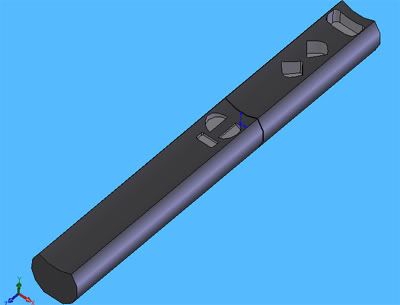
After 16 hours of nonstop sanding, I finally finished my foam form studies.
I hate sandpaper, and foam and many other things. Went out to dinner with the functionless buttons last weekend. They all laughed when the waitress gave me the biggest sized plate and what looked like 5 times the amount of food that I could actually consume. Afterwards we sat around in Rayna's beautifully decorated room and drank tea as the estrogen in the room continued to engulf us all. I head-cooked last friday. I made Filipino food (for 80 people). Everyone liked the rice cake and the lumpias. They were stuffed full of shrimp. I got a standing ovation.
Stanford is bathed in a really nice radiant light. And I wonder if that is because I'm not stressed out nowadays. 
My. Boyfriend. Is. So. Hot.
6.10.05
Graffix
Here is a graphic I did for the daily. I was inspired by the way Matisse emphasizes movement and human form through the use of curvilinear forms (or what my prof calls the Arabesque). Interestingly, the onset of modern art was brought about by the turn towards the primitive by Western "avant-garde" artists appropriating the racial other. This has absolutely nothing to do about this graphic. Anyway, just an art historical thought for the day.
27.9.05
a good song
A good song that mibie recommended to me. The band's name is Wir Sind Helden. Listen to "Nur ein Wort" I have no idea what they're singing about but sounds good to me. The band reminds me a bit of Stars. Yay Indie Pop.
Boo School.
17.9.05
Twenty Facts about Me
1. If I could spend my entire life in one place I would pick the Metropolitan Museum of Art.
2. I like mangoes with sweet rice. I also like lanzones, rambutan, mangosteens, mangoes, peaches(only the canned variety), raspberries (only when interspersed with layers of chocolate cake and icing), coconuts, and bananas (on my cereal or deep fried).
3. I believe in kindness, beauty, truth and in the Protestant work ethic.
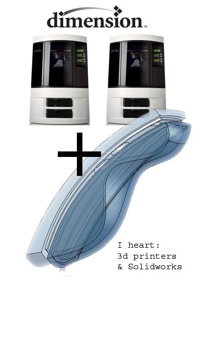
4. I really think that Solidworks 2005 is God's gift to all product designers of the world.
5. I think that Andy Warhol and his ilk are douche bags. The same goes for their design counterparts (i.e. Karim Rashid).
6. Mathematics is beautiful if I understood it. Human expression, especially of the visual kind is simply sublime.
7. When I was in kindergarten I wanted to be a baker because I thought their hats were cool. When I was in fourth grade I wanted to be an architect because it was a way to bridge the gap between fulfilling my asian parents' need for a utilitarian (i.e. lucrative) profession and my desire for artistic expression.
8. I am neither a baker nor an architect. I am a product designer. And it will take at least five pages to completely explain the nuances of such a profession so I just say "I'm a mechanical engineer who hasn't taken thermodynamics, or differential equations and instead I make art."
9. Indie music makes me happy. Sigur Ros, Broken Social Scene, Xiu Xiu. Joy!
10. I hate lazyness, idealogues and sanctimonius people. Also conservatives.
11. I love my brothers, Gabriel and Z. Although sometimes I want to bash Gabriel's head in for being an obnoxious 8 year old.
12. I lived in a third world country as a child. We did not have running water, phone lines and had very unreliable provider of electricity.
13. I collect turtle figurines.
14. I once pulled three straight all nighters: wrote two 5 page papers, studied for two midterms and prepared two oral presentations during spring quarter of Freshman year. At the end of the three days I called faculty members the "faculture" and babbled incoherently about the evils of socialism.
15. I think that Cuba is a fascinating country.
16. I went to the worst high school in the entire universe.
17. I designed parts for a fully automated colonoscopy machine the summer of my junior year.
18. My first impression of Americans when I immigrated to America: "Man, these people are tall."
19. I like to go "surfing" on the Path trains.
20. I once had a pet hen named Magnolia who was blind on one eye cause another Hen pecked it out while they were fighting for attention from the coveted rooster of the brood. I raised her ever since she hatched from the incubator. When she was too old to be of any use, my grandfather cooked her for our New Year's dinner. He told me it was her most noble way to die.
28.8.05
again on the jellyfish
I love under water deep sea-exploration and the beauty of mother nature. And by beauty I mean watching-giant-pulsing-undulating-electrical-jellyfish-spewing-glowing-
light-rays-being-eaten-by-bloblike-sharks-are-so-awesome.
Scientists are a friendly, atheistic, hard-working, beer-drinking lot whose minds are preoccupied with sex, chess and baseball when they are not preoccupied with science.
-Yann Martel, Life of Pi
Oh so true.
21.8.05
Sadie, white coat.
When i search through the catalogue of my memories I feel incredibly amazingly happy to have them filled with a full summer's worth of time spent with Jon. No stolen moments of the unabashed kissing in cafe's of New York, no brief weekends amidst piles of schoolwork, just 2 months of getting to hang out with him. Last night he asked me what my favorite moments of the summer were and surprisingly I couldn't name any. As I was scanning through my head, I could only point mundane moments really.
Nights spent huddled over our little stove burner waiting for water to boil, or for the rice to get done, Saturday mornings spent drinking tea and watching him play Final fantasy tactics and bike rides back to work and reality on weekday mornings.
Yesterday was our last bike ride together. Once more through the streets of Greer we began our noble quest. We took "our route" through Loma Verde and Bryant because the lights always switch for bikers through Oregon and then Embarcadero. Once again through the beautiful suburban houses of the successful Palo Altans, while I look at Jon work out his preference of running over the speed bumps in the road "look Jai I'm getting all 30 of them" he'd say, I realized I would miss this terribly.
And all that I've got
and all that I need
I tie in a knot
that I lay at your feet.
Mingaw ko nimo
13.8.05
no title
The southwestern barbeque salad in safeway is the best thing on earth. Well its the best thing on earth during my lunch time at least.
I've been listening to Dan Brown's Angels and Demons on audio tape with the guy I carpool with. It was exciting for the first few chapters. It reads very much like a suspense novel. But after a while the stupid formulaic plot just got really annoying and one can only take too much bad dialogue in one sitting. I've never heard so much about the Catholic church (albeit in Brown's fictionalized although adamantly claimed to be authentic world) since high school.
"Seraphim!, of course, literally the fiery one" . Anyone who takes Dan Brown seriously has got to be a douche bag, or should I say a douche brain? Seraphim is just the plural form of seraphs!
Sculptors i've decided, (the classical type i.e. Rodin , old masters) are super cool! It'd be so awesome to be able to carve something really great in marble! I wonder if a four axis CNC machine could carve out the pieta. That would be an interesting undertaking. We can get an Xray scanner created a 3d solid object from it. Load it up on Gibbs cam and fire it away.
Oh the wonders of technology.
27.7.05
The Sunol Exit
I travel 30 miles to work everyday. I like looking out the window to see California through its freeways, exits, gas stations, and bridges. It is a stark difference to the gray pavement that goes on endlessly in the New Jersey turnpike, peppered only sometimes by the occasional spindly tree or a flock of malicious pigeons. Nope, in California its different. Crossing the Dumbarton Bridge, sometimes when the tides are low there is a tiny island about a meter in diameter jutting off of the placid (and clean!) water. Sometimes I like to pretend that it were my island and I were two inches long and I can sleep there, nestled by the grass everyday, eating worms for breakfast, and having the best life ever.
I know that we've almost reached the Pleasanton exit when we've reached the Sunol foothills. The grass is a golden yellow, almost like long dog's fur. I'd like to pretend that the mountain was a giant creature's sleeping mass and that by the time I start workign, the giant wakes up and eats the passing drivers. Its a good thing I'm nestled here safely in my air conditioned cubicle, listening to the radio, and plowing the day away.
12.7.05
3.7.05
Steve Jobs' speech and Jon's ideas on hair
I finally read the transcript of Steve Jobs' speech . It was a really good speech and with my previous string of unemployment and failed job interviews, 4-mile long bike rides to home, and sometimes, general starving-to-death type deal i've been subjected to, the speech really resonated with me. Go check it out. One of the best commencement speeches I've heard. Definitely better than Sandra Day O'Connors and definitely better than that Peruvian president from last year.
On a lighter note, I gave Jon a haircut today. He had a theory on why people go bald. He said that maybe some hairs are male and some hairs are female. Supposedly the females just die out when you turn 40 or so and so the males have no one to have sex and reproduce with. I wonder why it starts from the middle outward. There must be some sort of hair-killing STD or something that starts from the middle of the head. Well Jon says also that people's messing with their front hairs also propogates the "death" of these female hairs. Its all very confusing and still a theory right now. But you know, just a thought.
29.6.05
Super intense lasers and employment
Yesterday Jon and I went to a free talk at SLAC (Stanford Linear Accelerator Center) about lasers. We biked up Sand Hill road and it felt like dying (Biking is perhaps the only activity in which "downhill" has a happy connotation). Before going to the talk we had a celebratory dinner at the Treehouse for my employment at a product design firm (WOOOOOT. I got a job. Sweet Jesus I found a job). I will be working as a design/engineering intern for Compass Product Design up in Pleasanton. The ordeal of getting to the actual firm for the job interview is worthy of a blog entry but I'll just skip over most of that. So the bike up to SLAC was tiresome but the scenery was quaint. Palo Alto really is a great city for bikers.
Jon showed me his office. On our way there, there were three very scrawny, very geeky looking middle aged scientists playing Frisbee on the grounds. They look really excited and happy. This place looked like a haven for nerds! When we reached his building (A&E) there was a sphere concrete "sculpture" with a very crudely painted smiley face on it. It looked rather strange. Like some neanderthal had plopped it there and certainly possessed a quality so starkly different from all the other sleek looking "modern" sculptures smattered across the campus. I told him that SLAC looked and smelled like Caltech. And by Caltech I mean despair.
The talk was sufficiently water down lecture on optics and lasers. I still didnt quite understand most of it, but lasers are brighter than the sun! Also you cannot magnify the intensity of a light source using lenses. The best you can do is actaully just replicate the intensity of the source. For instance, during the process of burning an ant using a lens, while you are still gathering the brightness and heat of the sun, you are not magnifying it. In fact supposedly you can calculate this using math. But who needs that really? Finally, the speaker started talking about his own research and being able to create the ultimate intense light source using the Linear Accelerator and a 2 mile long string of laser beams using short pulses as a way of magnifying their intensities. He says that they could get it to be so bright that the photons will actually destroy each other!
This inspired Jon to come up with theory to explain something in science fiction. Supposedly if something and its anti-thing will collide, they will cancel each other out. For instance, an electron and a positron will cancel each other and become a new particle (?) maybe? Or maybe just annihilate each other. This is why if you can travel back in time you should never touch your you-of-the-past. Because an anti-thing is just something that is travelling back in time, and a thing is something going forward in time. When you collide with your past self, you will just simply.. self-destruct.
Thats enough pop science for today my dearies.
24.6.05
motion
I've never been very facile with motion. By facility, I mean : the skill at which I represent, analyze and even implement movement of all manners and sorts. For instance, I did poorly in Physics 53 (Mechanics). My professor, a very kind, well meaning, articulate, mother-like, (yes she was female (!) woman named Pat Burchat, made every effort to make the transfer of knowledge about the kinematics of rigid bodies as easy as possible. She would stand in the lecture hall of TC Seq, with her giant magnetic Vector arrow and stick it to the board, point it out of the board in all manners and in quite animated ways, but it still didn't work. The vectors looped through my brain in a tangled knot of confusion.
In a painting session that my instructor dubbed to be the "testing moments of our painting careers as we have known it" I did a rather poor representation of a ballerina in Giacomo Balla's painting style. For this event they had hired a professional ballerina and she danced for these lanky painters for two hours with only a five minute break in the middle. She was quite graceful. She had even brought two meter long gauze ribbons in many colors to even further highlight the grace with which she moved. I tried to represent it with a rapid succession of lines representing jaggedly repeated dynamic movement. The Futurists would have rolled in their anarchic graves. My teacher, Charles Parness, a very skilled portrait painter told me, "this is not very good , kid. I suggest you practice more". I agreed with him whole heartedly, promising to myself to never paint moving objects again. "Apples dont move", Cezanne even said. He's a smart painter.
Funny that I work for a virtual reality lab doing just this. My job is to animate dummy people and make them do all sorts of things. My professor likes to study human beings feeling of "presence" during interaction with virtual human beings. My job therefore is to make compelling movements to make these virtual people feel lifelike and human. I tug the "strings" of the virtual puppets adding every keyframe hoping they convey some sort of "human feel" whatever that means."
My friend Jolly says that I walk rather slowly. I told her, "Jolly, poets don't walk , they stroll." I like to look at things. I especially like to look at things that are still. Wouldn't it be great if the entire world were submerged in some type of substrate that would make everyone move 20 times slower. Then everything would be a lot easier to look at.
23.6.05
Spam and Ham
There's a new breed of spam that I am getting these days. They've been using random polysyllabic words to make names from the senders of advertisements for penis enlargement devices, free Viagra and Cialis, and Loan Consolidation programs (shows what Americans care about). For instance, today I got spam from Implementation G. Dishonesty and Imprisonment O. Mammoths. I especially love the middle initial touch. I wonder what G and O is. Maybe Geriatric? or Orthogonal? Wouldn't it be great to name your kid that way? Hi these are my children, Polyamorous Imprisonment and Unctuous Pandemonium. Pandemonium get off the couch right now and eat your broccolli (sp?). I'm beginning to like the sound of that!
Yesterday, Jon and I went on our first grocery trip. I, armed with my TI-83, made sure that our purchase was only a total of 41.35 (including tax). Jon told me that unprocessed food aren't taxable (who would've known?). They had strawberries for a dollar each(!). Everyone run to the nearest Safeway to get strawberries by the truckloads. This is it, ladies and gentlemen, the highlight of my day was being able to purchase my groceries for only a dollar. Isn't that great. We used Abby's Safeway Club card and that saved us 20 more dollars! Wahooo. I sleep soundly at night knowing that my dollars are used the right way (on strawberries and 60 cent canned corn!). Jon says if I like corn so much we should move to Indiana. Well I like potatoes too, so I guess we should move to Idaho!
I saw Lost in Translation again last night. Lip my pantyhose Mr. Hollis. Lip my pantyhose!
21.6.05
Stanford-at-Greer
There is something characteristically French-like about the French house. I'm not sure if its how clean it is relative to Terra, the house where I live during the year, that is unnerving, but there's something definitely French about it. (Maybe cause its called the damn FRENCH house maybe).There is the giant Faux Matisse mural in the dining hall and the really well executed imitatation De Chirico (wasn't he spanish... who knows) that makes it Parisian even.
I biked with Jon through the long and arduous journey through Stanford-at-Greer all the way through the cheerful, flower-lined paths of the Embarcadero through the now filled-with-little-people-and-camp-going-athletes Stanford campus to the French house. The streets that cross the Embarcadero start off as flowers. Iris St., Petunia Lane and what not and then progressively into authors. By the time we reach Louis, which incidentally is not a flower or an author, I got really tired. Its a good sign when we've reached Mark Twain, but then we cross Brett Harte, who I've never heard of. That bothers me , for a second.
I do know another Brett, in fact Abby and I both know of him and have mentioned him quite frequently during our discussions of admirable PRL TA's and dashingly cute-in that I'm- a- really- Gruff-man-and I'm-wearing-a-Jon-Deere-shirt kinda way-"your project is Tits" kinda way. By the way, just a disclaimer for possible boyfriends who might be reading this, that is actually just mostly Abby's comments. It was her project that was characteristically Tits even!
I got tired out when we finally reached the French house. I went to sleep while Jon went off to join to working world. I of course, the unemployed waif, went to bed for two more hours. I got up to the sound of radio noises. You know, the type that makes squeeky noises and you communicate people with (think World War II ), not the radio-in the radio and alarm clock combination that blasts spanish music that Jon has by his bedside. I always wonder how he has such an uncanny ability to know what the spanish stations are. I mean he just moved to Palo Alto! So anyway, someone was on the radio " We need mops at French house, over". "I am at French house, over, be right there with the mop". Anyway, in my half-asleep haze, I sort of imagined myself to be the lady-protagonist in 1984 (yes the book, not the year) with my incognito-not-supposed to be here fear of being caught by the janitor. So I lulled myself into this fantasy and I started hearing footsteps. I could hear more noises and I was sure they were all going to catch me, handcuff me and throw me in the local jailhouse or something. In my hysteria I hid in Jon's walk in closet (the French house has walk in closets? I've been totally jacked with living in Co-ops). After waiting for about 10 minutes, I step out of his walk in closet, pee in the bathroom and ran the hell out of there.
I dont like the word somnolent.
19.6.05
Dragons, Giant Squid and Blue Aliens
Went to play Katamari Damacy today. It was amazing. I had to roll around a ball and pick up various random and sundry things like: giant octopi, cows, pedestrians, jumbo umbrellas, tacks, legoes, mountains all in this giant clump to replenish the stars that the king of the cosmos (the prince of the cosmos's i.e. the protagonists') had destroyed inadvertently in his sleep. It was a brilliant game. Like Super Mario only more irreverent and better graphics in 3d. 
Picking up clumps of stuff
I also finished Dragon World on my cellphone. It was a really uneventful end to the game. The only big challenge was killing all those damn lava spewing plant things. The dragon itself was just a head that moved up and down the screen and it was pretty weak. He just kept spewing this lava burst thing straight across the screen. Totally lame.
I have seen a fair bit of good movies this week including: the Cabinet of Dr. Caligari, Fantastic Planet, Stalker (by Andrei Tartakovsky), Dil Se, Reality Bites and Rushmore.
wonderful cinematography in Dil Se
Fantastic Planet was an animated movie from France made in the 60's that was apparently an "allegory" about something or other. There were humanoid creatures oddly dressed in erotic / s and M like clothing that were under the control, actually kept as domestic pets of these giant blue alien creatures ( I forgot what they were called). Anyway, there were lots of sex/drug/drugs and sex references throughout the whole movie and a really weird soundtrack that sounded like a cross between porn music and 80's video game soundtracks. Anyway, that was the most remarkable of all the movies I think.
Traags enslaving the Oms. Yum
Rushmore is always good though. Jon really likes the "I'm going to pop a cap in your ass" comment. I think its a really great movie. The closing scene with all the characters in the movie dancing was really good.
Jon's my boyfriend by the way. I really like him
Subscribe to:
Comments (Atom)