Clement Greenberg, in his essay, Modernist Painting, argues that the essential and unique element of a painting is its flatness . Literal flatness is the physical flatness of the surface of the canvas and a depicted flatness is the flatness portrayed by the artist’s usage of form, shape, and value in the image. In Cubism, where traditional modes of creating mimetic space within the image have been abandoned, we find a conflation of literal and depicted flatness. Previously, linear perspective has been the most popular means of depicting space in an image. This same perspective orders the canvas into clear and mathematical renderings of planes and depth. Cubists created a method of representation that completely abandoned the use of perspective. This exploration delineated the necessary and sufficient conditions of a pictorial space that demonstrates depth without resorting to naturalistic painting techniques. Both artists achieved this by allowing both literal and depicted flatness to overlap and sandwich each other on the picture plane, creating a sense of spatial ambiguity. The oscillation between surface and depth creates an illusion of space and a new method of signification that ultimately breaks away from the representational. In doing so, both artists demonstrate the limits of painting as opposed to the limits of natural representation.
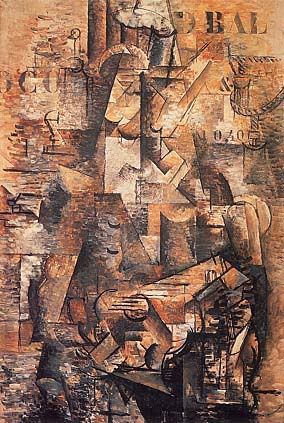
Braque, The Portuguese, 1911
In Braque’s 1911 painting, The Portuguese, we find a good example of the overlapping planes of literal and depicted flatness. The depicted flatness consists of the amalgam of planes painted parallel to the picture plane, the unconventional use of chiaroscuro, and the lines that signify open and overlapping forms. The picture consists of multiple geometric shapes set side by side in a shading scheme that does not render the objects to look three dimensional and instead create a lattice of seemingly incongruous gradients of light and dark across the picture plane. Further, in the image we often find dark objects adjacent to completely bright objects. In a naturalistic painting with a well- defined light source, this cannot occur if we assume that the objects are three- dimensional. The shapes or facets are all parallel to the picture plane, as none of the lines seem to signify traditional orthogonals that recede into a single vanishing point. The diagonal lines in the image do not converge and instead seem to form edges of shapes and objects. The grid of geometric elements creates a compressed cubist space of pattern across a single plane on the canvas.
The literal surface of the painting is hinted at by several visual cues. The most prominent visual cue is Braque’s use of stenciled letters on the upper half of the image. Letters provide an interesting counterpoint to the other graphic elements of the painting because they occupy a physical space while connoting a linguistic non-representational element within the image. Thus, the letters are graphic elements that both have color, line, shape, form within the picture plane, but they also represent language and semantic meaning. Thus when we see letters, we are at once convinced of their non-representational meaning. Letters occupy a space on the picture plane that is on a different level than the depicted flatness. The letters sit on the literal surface and highlight the flatness of the canvas. However this flatness is made ambiguous by brushstrokes that interrupts the flatness of the stenciled letters. In isolated areas in the painting we find the first instance of oscillation between surface and depth. The stenciled letters’ unequivocal frontality is interrupted by brushstrokes that had previously belonged to the background grid of cubist shapes and non-mimetic chiaroscuro. The literal, depicted, and literal flatness are interspersed between each other.
More of these ambiguities between both elements exist within the image. The lack of orthogonals and traditional depth cues cause the space to contract making it hard to synthesize a unified image. When both literal and depicted planes are parallel to each other, it is difficult to determine their spatial relations. Thus we find elements in the image where both literal and depicted surfaces mesh together and create an illusion of a surface that is deconstructed. The line, shape and form become an unintelligible mass of pictorial elements. Both artists mediate this by introducing the use of line and contours of shapes that signify a more “representational” rendering of the subject matter. For instance, in The Portuguese we find lines that depict guitar frets, a nose on profile, an arm, and a mouth. These depicted objects are smattered across the canvas pinning the unmoored chiaroscuro into localized areas of pictorial coherence. These shapes break the grid of cubist geometry while still appearing to belong to the same picture plane. This prevents the image from breaking down into complete abstraction while still maintaining its depiction of absolute flatness.
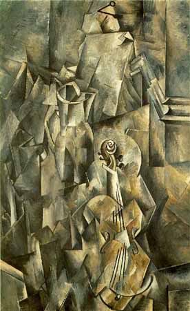
Braque. Still Life with Violin and Pitcher
In another Braque painting, Still Life with Violin and Pitcher, a similar repetition of lines and shapes create a flat geometric grid. Similarly, the grid is interrupted by pictorial elements that add a sense of order to the mosaic of parallel facets and planes. However, in this image, Braque takes one graphic element and renders it with a high sense of realism, or trompe-l’oeil. The trompe-l’oeil pin rendered with shadow and linear perspective on the upper area of the canvas further highlights the sense of flatness of the other elements of the picture and synthesizes all the other elements into a unified picture plane that rests beneath the 3-d surface of the pin. The three dimensional form of the pin and the space that it occupies unifies the geometric patterns into a single flat surface. The pegs and the peg frameset are also painted with the same high degree of realism and thre-dimensionality. Similarly, the juxtaposition between the flat pictorial cubist elements of the geometric grid and the three- dimensionality of forms rendered in accurate chiaroscuro creates a dynamic tension between the various planes in the image. The trompe-l’oeil pin sandwiched between the literal flatness of the canvas and the depicted flatness of the imagery again oscillates between surface and depth. While we initially apprehend the two-dimensionality of the facetted shapes, the “surface” is pushed back when we realize the existence of the pin, which itself has size, dimension and occupies a three dimensional space.
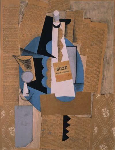
Picasso. Glass and Bottle of Suze. 1912
A similar oscillation of surface and depth occur in papier colle. Greenberg explains that the progression of using stenciled letters, to the use of large areas of wood veneer or sand synthesized the cubist geometric grid into a larger shapes that balanced the large areas occupied by these new pictorial additions grew naturally out of the way in which the individual elements of the images were being read. Thus in Synthetic Cubism, the facetted planes completely disappear and are replaced by large areas of paper cut-outs or newsprint. Similarly, surface and depth oscillate as the abandonment of chiaroscuro allows for a figure-ground reversal in several areas of the canvas. For instance, in Picasso’s 1912 papier colle, Glass and Bottle of Suze, the blue circular shape in the center of the image has a physicality reminiscent of the stenciled block letters of analytical cubism but it also serves as a background plane to the planes occupied by the glass and bottle. Its serves both as depicted background because of the way in which the other depicted objects overlap the shape and also as a marker of the literal flatness of the picture as both foreground, the white Suze bottle, and background, the blue plate share the same planar depth in the picture plane. Both paper cut-outs exist on the same plane even if they denote two objects that are overlapping each other.
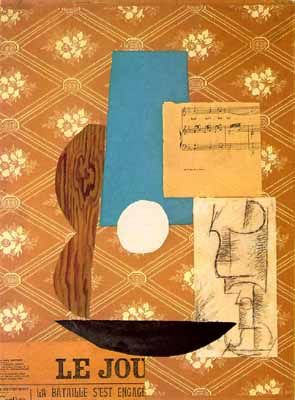
Picasso. Guitar, Sheet Music, and Glass. 1912
Remnants of the linear elements delineating shape still occur at several parts of the image, most visibly on the surface of the glass and sometimes outlining the edges of the cut or torn newsprint and paper. The rows of overlapping newsprint highlight the literal flatness of the surface on which it is pasted but the intermittent charcoal outlines around the newsprint push the plane back, giving it a sense of depth. The newsprint functions as both surface and background, figure and ground.
In Picasso’s 1912 picture, Guitar, Sheet Music, and Glass, multiple “readings” of the configurations of the paper cut-outs exist. For instance, the piece of white paper with a charcoal drawing depicts both a cup and the shape of the guitar. Similarly the bottom black shape can both be a bowl or the outline of the guitar. Aside from the slight modeling on the cup, no effort is made at depicting three-dimensionality. The painting is a composite of shapes that all occupy the literal surface of the picture plane. Through the viewer’s own cognitive interpretations the configuration of shapes reveal a construction that is pictorially coherent. Even without a depicted surface and depth, the viewer restructures the image according to the relationship of the individual parts to the whole. A foreground can be simultaneously a background as the cup can once be a figure, or the ground behind the guitar. As the surface becomes completely flat, and depth is annihilated, the images take on a higher degree of ambiguity. The Cubists invent a new method of representation in which the undepicted is transformed into a coherent image without the aid of naturalistic painting techniques. Through the ambiguity of the depicted surfaces, the image is reconstructed by its literal and depicted flatness.
